Widget Settings
The Appearance page controls how your chatbot looks and behaves on a real site. It also includes the embed snippet for the current bot and a live preview that updates while you edit, so most visual changes don’t require re-embedding the widget.
Open it from the bot’s left sidebar → Appearance (under Customizations).
Page Layout
| Area | What it is for |
|---|---|
| Chat Widget Embed | Copy the script tags for the current bot. |
| Chat Interface | Configure the launcher, theme, identity, greeting, quick questions, visibility toggles, and escalation behavior. |
| Chatbot Preview | Check draft settings before saving. |
The content area uses a two-column split on desktop: settings on the left, preview on the right. On smaller screens, the sections stack.
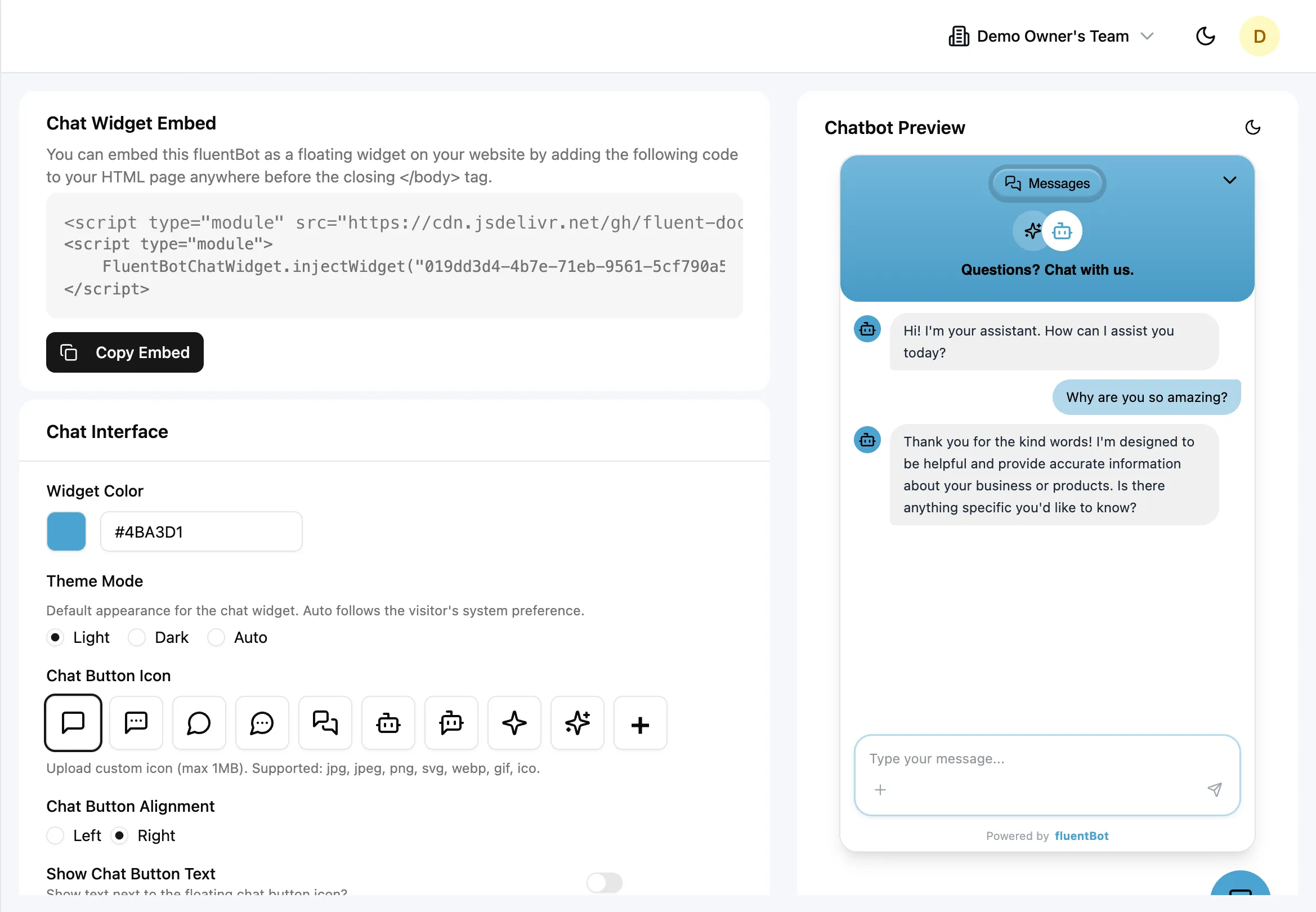
Chat Widget Embed
The Chat Widget Embed card generates the two script tags for this specific bot:
- The first script loads
chat-widget.jsfrom the configured widget base URL. - The second script calls
FluentBotChatWidget.injectWidget("<bot-id>"). - Copy Embed copies the full snippet.
Paste the snippet before the closing </body> tag on the site where the widget should appear. Appearance changes are stored server-side, so changing colors, copy, quick questions, or escalation settings doesn’t require copying the snippet again.
For platform-specific installation steps, see Embed the Widget.
Chat Interface
The Chat Interface card is the main configuration surface. It’s grouped into appearance, launcher, identity, conversation starters, visibility, and escalation controls.
Theme and Color
| Setting | What it controls |
|---|---|
| Widget Color | Primary hex color for the launcher, header, accent states, and visitor message tint. Type a hex value or click the swatch to open the color picker. FluentBot derives secondary/readable text colors from this value. |
| Theme Mode | Default widget theme: Light, Dark, or Auto. Auto follows the visitor’s system preference. Visitors can also toggle theme inside the widget. |
Launcher
| Setting | What it controls |
|---|---|
| Chat Button Icon | Icon inside the floating launcher. Choose a preset icon or click + to upload a custom image. |
| Chat Button Alignment | Floating launcher position on the visitor’s screen: Left or Right. Default is Right. |
| Show Chat Button Text | Shows or hides a text label next to the launcher icon. |
| Chat Button Text | Label text shown when Show Chat Button Text is on. Default is Help. The field is disabled while the toggle is off, but its value is preserved. |
Custom launcher icons must be under 1 MB. Accepted formats: jpg, jpeg, png, svg, webp, gif, ico.
Branding and Identity
| Setting | What it controls |
|---|---|
| Bot Avatar | Avatar used for bot messages and identity in the widget. Choose None, a preset icon, or upload a custom image with +. |
| Header Logo | Optional logo shown in the widget header. Choose None to remove it, or click + to upload a logo. |
| Title Text | Header title for the widget, initialized from the bot name when the bot is created. Use a short visitor-facing name such as Acme Support or Billing Assistant. |
Avatar and logo uploads use the same 1 MB and image-format limits as the launcher icon. Replacing or clearing an uploaded file removes the old uploaded file when settings are saved.
Conversation Starters
| Setting | What it controls |
|---|---|
| First Message | Initial bot greeting shown when a visitor opens the widget. The dashboard enforces a 300 character limit and shows a live counter. |
| Quick Questions | Starter prompts shown as clickable chips when the widget opens. Add up to 3 questions, each up to 100 characters. Empty questions are trimmed out before saving. |
Use the first message to set expectations, not to list every capability. For quick questions, pick the most common visitor questions so people can start without typing.
Visibility
| Toggle | Default | Effect |
|---|---|---|
| Show Sources | On | Displays source citations under bot replies when source data is available. |
| Show Branding | On | Shows the Powered by fluentBot footer in the widget. |
| Show Message Status | On | Shows delivery and read status indicators on messages. |
| Show Agent Availability | Off | Shows whether agents are online or when they were last active. |
Escalation
Escalation settings control how visitors move from AI self-service to a human conversation. See Live Chat for the agent-side workflow.
| Setting | What it controls |
|---|---|
| Human-Only Mode | When on, no AI replies are sent; every visitor message is routed to human support. When off, AI replies normally and handoff uses escalation settings. Default is off. |
| Enable Human Escalation | Allows visitors to request human support from the widget. This appears when Human-Only Mode is off. Default is off. |
| Escalation Button Text | Button label visitors click to request human support. Default is Talk to a human. |
| Waiting Message | Optional message shown while the visitor waits for an agent. Keep it short and specific. |
| Auto-Escalation | Enables trigger-based handoff rules. Turn this on before enabling trigger-specific rules. |
| Escalate on Unanswered | Auto-escalates after the bot can’t answer enough visitor questions. |
| Unanswered Threshold | Number of unanswered questions required before auto-escalation. Default is 3; valid range is 1 to 10. |
Use a lower unanswered threshold for high-touch sales or urgent support flows. Use a higher value when you want the bot to attempt more self-service before involving agents.
Limits
| Setting | Limit |
|---|---|
| Title Text | 255 characters |
| Chat Button Text | 255 characters |
| First Message | 300 characters in the dashboard |
| Quick Questions | 3 questions, 100 characters each |
| Escalation Button Text | 255 characters |
| Waiting Message | 200 characters in the dashboard |
| Unanswered Threshold | 1 to 10 |
| Uploaded icon, avatar, or logo | 1 MB |
| Upload formats | jpg, jpeg, png, svg, webp, gif, ico |
Saving
Click Save Changes at the bottom of the form.
- The button is disabled until you make a change.
- Users without the Update widget settings permission can view settings but can’t save changes.
- Pending icon, avatar, and logo uploads are uploaded first, then the settings are saved.
- Quick Questions are trimmed and empty entries are removed before saving.
Embedded widgets pick up saved settings on the next page load or widget initialization. Already-open visitor sessions may need a refresh or navigation before they show the new configuration.
Live Preview
The right pane renders a widget preview with your current draft settings. Use it to:
- See exact colors against light and dark backgrounds (toggle the preview theme).
- Verify icons display at the right size.
- Check button alignment and optional button text.
- Confirm bot avatar, header logo, first message, quick questions, and branding.
- Read your greeting copy aloud — that’s how visitors will read it.
The preview is interactive enough for layout review, but messages aren’t sent and source/status behavior is represented with sample content.
What’s not configurable (yet)
- Custom CSS overrides.
- Per-page widget variants (one config per bot).
- Custom fonts beyond the bundled defaults.
- Email capture gating modes from this screen.
If you need those controls, build a custom UI on top of the API directly — see Integration.
Troubleshooting
- Save Changes is disabled — no tracked setting has changed, or your role doesn’t have the Update widget settings permission.
- Logo, icon, or avatar upload fails — confirm the file is under 1 MB and in an accepted image format. Don’t rename a non-image file to look like an image.
- Chat Button Text doesn’t appear — turn on Show Chat Button Text. The text field alone doesn’t make the label visible.
- Escalation fields are missing — turn off Human-Only Mode, then turn on Enable Human Escalation.
- Auto-escalation doesn’t trigger — confirm Enable Human Escalation, Auto-Escalation, and the specific trigger, such as Escalate on Unanswered, are all on.
- Quick Questions over 100 characters are rejected — trim each starter question to the hard limit.
- Visitor still sees old colors or greeting — reload the host page. Already-open widgets can keep the old settings until the next initialization.
What’s next
- Embed the Widget — drop the widget on a real site.
- Live Chat — handle escalations once visitors trigger them.
- Playground — test the underlying answers before tweaking the surface.