Widget Customization
The chat widget is heavily customizable from the bot’s Appearance page. Everything below ships without a code change — settings are saved for the bot and applied on the visitor’s next page load.
For the screen-driven walkthrough see Widget Settings. This page is the feature reference: what each control does and the trade-offs.
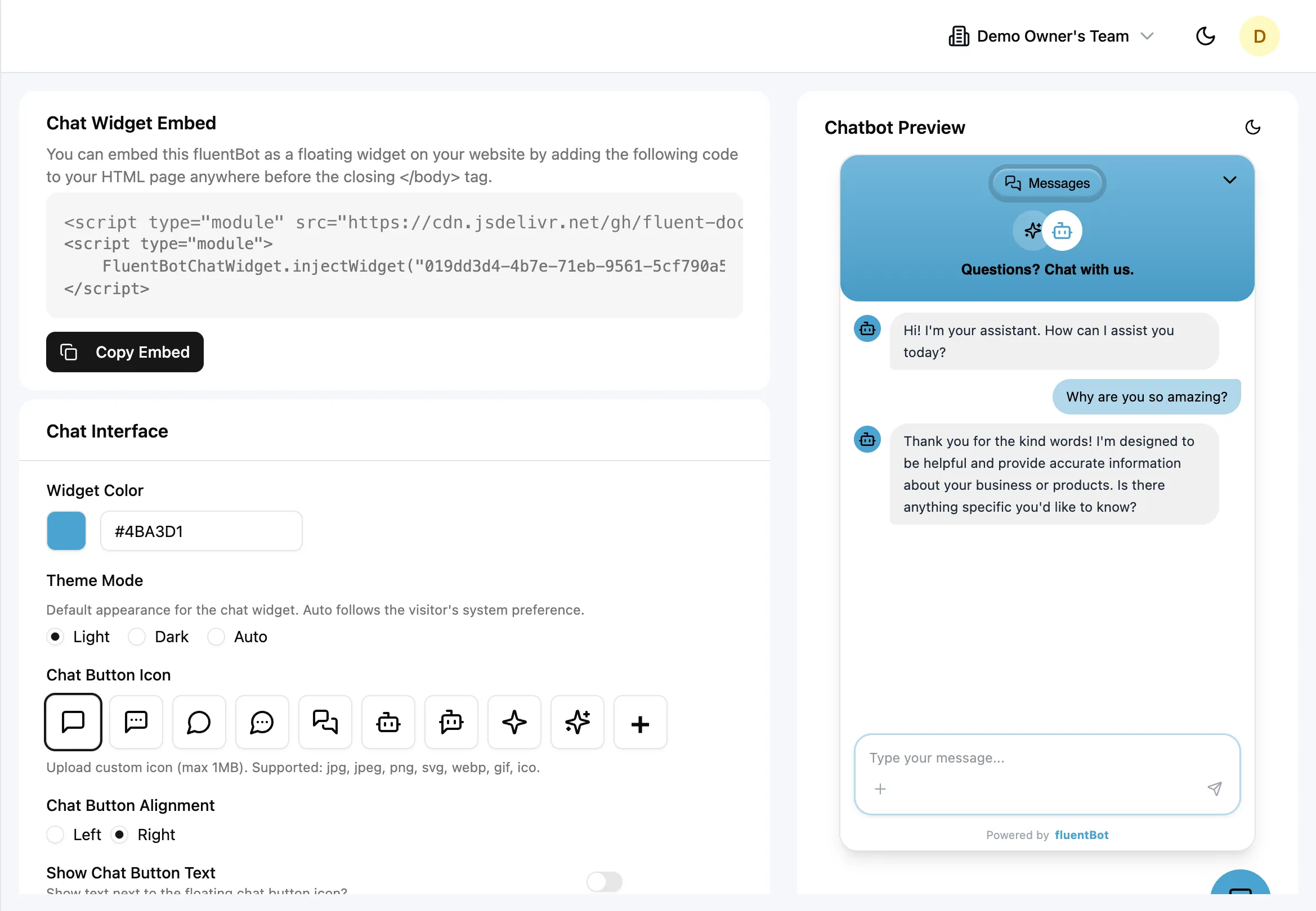
What you can change
Color & theme
- Widget Color — primary accent (button background, message tints). Hex input + color picker.
- Theme Mode —
Light,Dark, orAuto(follows the visitor’s OS preference).
Pick a primary color that contrasts well in both themes. Auto handles the rest.
Branding
- Header Logo — optional image at the top of the chat panel. Up to 1 MB. Skip if you’d rather lead with the bot title.
- Title Text — the header label (e.g. “Acme Support”).
- Show Branding toggle — toggles the Powered by fluentBot footer.
- Bot Avatar — preset or custom image displayed next to bot replies.
Chat button
- Chat Button Icon — preset icons or your own upload (1 MB max).
- Chat Button Alignment —
LeftorRightedge of the screen. - Show Chat Button Text + Chat Button Text — show a label next to the floating button (e.g. “Help”). Useful when the icon alone isn’t self-explanatory.
Greeting & quick questions
- First Message — the initial bot greeting (max 300 chars). Shown when a visitor opens the widget.
- Quick Questions — up to 3 starter prompts (each ≤ 100 chars), rendered as clickable chips on the welcome screen.
Pick your three most-asked questions for the chips — visitors who don’t know what to ask will tap one.
Visibility toggles
| Toggle | Default | Effect |
|---|---|---|
| Show Sources | On | Source citations beneath each bot reply. |
| Show Branding | On | ”Powered by fluentBot” footer. |
| Show Message Status | On | Delivery / read indicators on messages. |
| Show Agent Availability | Off | Show whether agents are currently online. |
Escalation
- Human-Only Mode — bypass the bot entirely; every message goes to a human agent.
- Enable Human Escalation — surface an “escalate to human” path in the widget.
- Escalation Button Text — customize the human handoff button label.
- Waiting Message — optional message shown while the visitor waits for an agent.
- Auto-Escalation — enable trigger-based handoff prompts.
- Escalate on Unanswered — show a handoff prompt after unanswered bot responses.
- Unanswered Threshold — number of unanswered responses before the prompt appears, from 1 to 10.
See Human Escalation for the full picture.
What’s not configurable today
- Custom CSS overrides — the widget renders inside Shadow DOM precisely so host CSS can’t leak in. Custom CSS for the widget itself isn’t exposed.
- Per-page widget variants — one config per bot. To run different greetings on different pages, use a different bot per page.
- Custom fonts beyond the bundled defaults.
- Email capture gating modes from the Appearance screen — see Email Capture for what is supported.
Those areas are not configurable from the Appearance screen today.
Image upload limits
For header logo, custom button icon, and custom bot avatar:
- Max size: 1 MB.
- Accepted formats: JPEG, PNG, SVG, WebP, GIF, ICO.
Files over the limit or in unsupported formats are rejected with a validation error.
Saving changes
Click Save Changes at the bottom of the form. The button is disabled until you make a change. Changes propagate to embedded widgets on the next page load — already-open visitor sessions pick up the new settings on their next navigation.
Live preview
The right pane on the Appearance page shows a widget-style preview rendered with your draft settings. Toggle the preview between light and dark to verify both themes before saving.
Troubleshooting
- Visitor still sees the old widget — they have a cached bundle. New page loads pick up new settings.
- Logo upload fails — confirm under 1 MB and in an accepted format. SVG must be a valid SVG file (not a renamed bitmap).
- Color contrast looks wrong in dark mode — the same primary color is used in both themes. Pick one that contrasts on both backgrounds, or accept slightly different feel per theme.
- Quick Question over 100 chars rejected — there’s a hard cap. Trim and re-save.
What’s next
- Widget Settings — the full Appearance screen reference.
- Embed the Widget — drop the widget on a real site.
- Identity verification — sign visitor identity for authenticated sites.
- Human Escalation — escalation triggers.